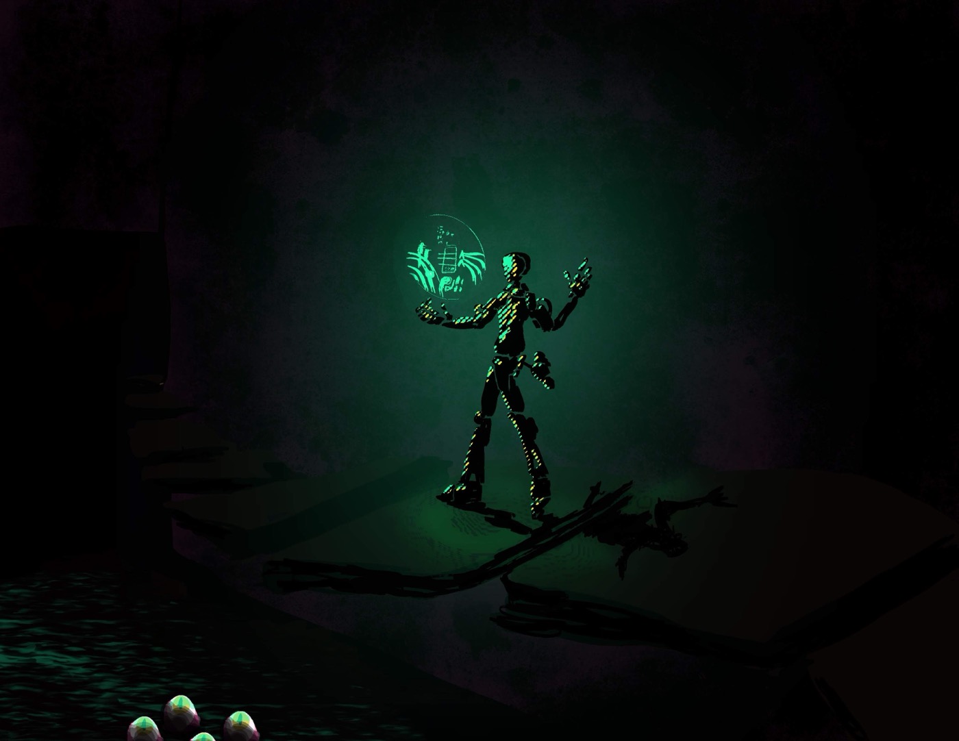
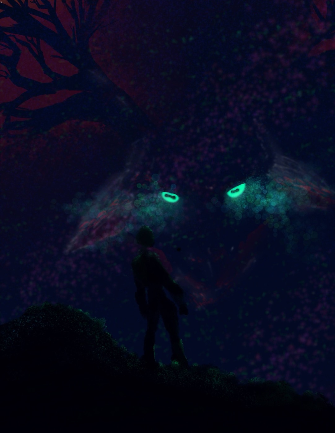
After Hours // The Monster’s Den HermitMonster · Art stuffHermitMonster · After dark

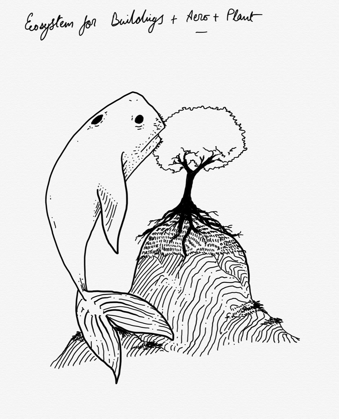
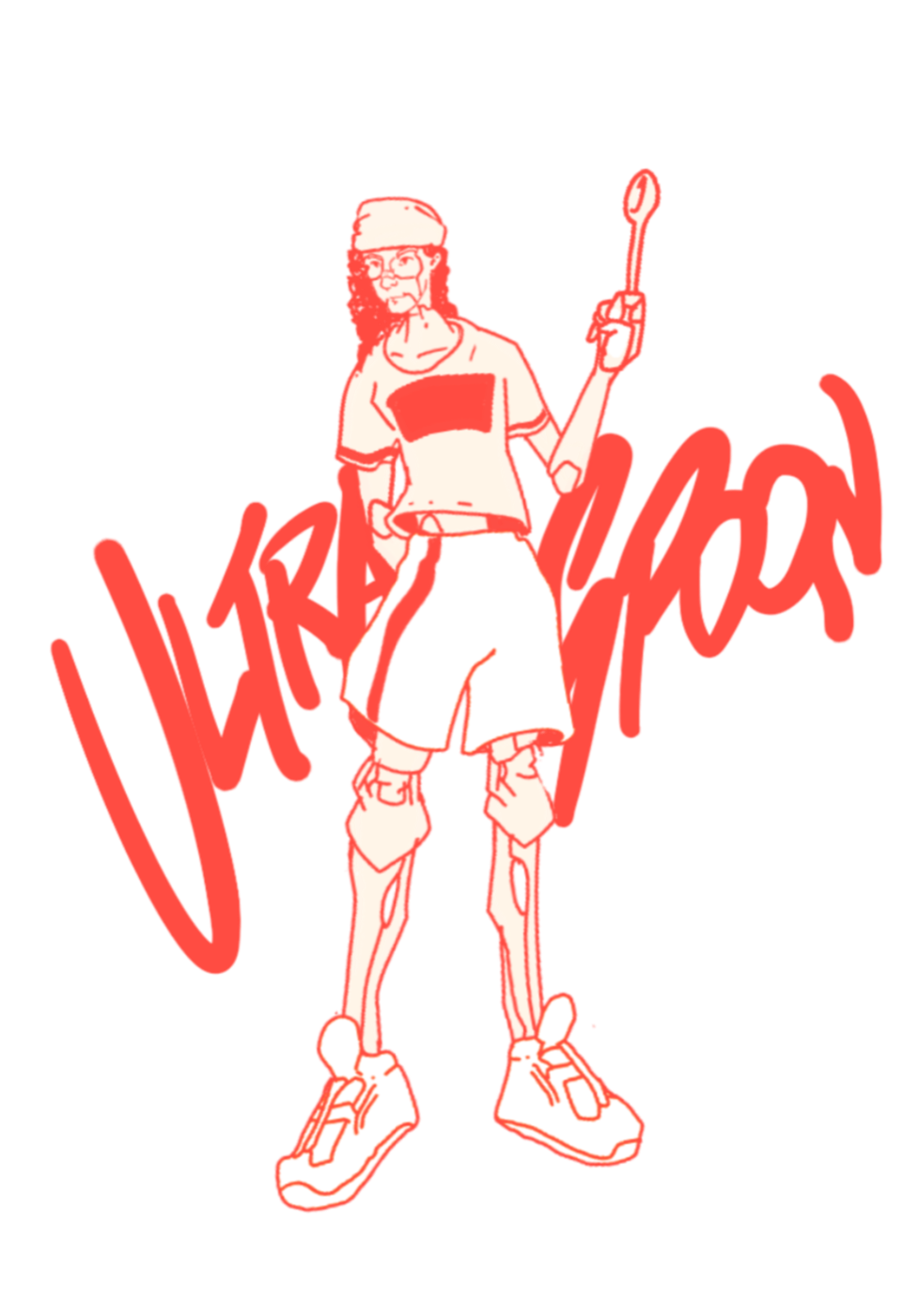
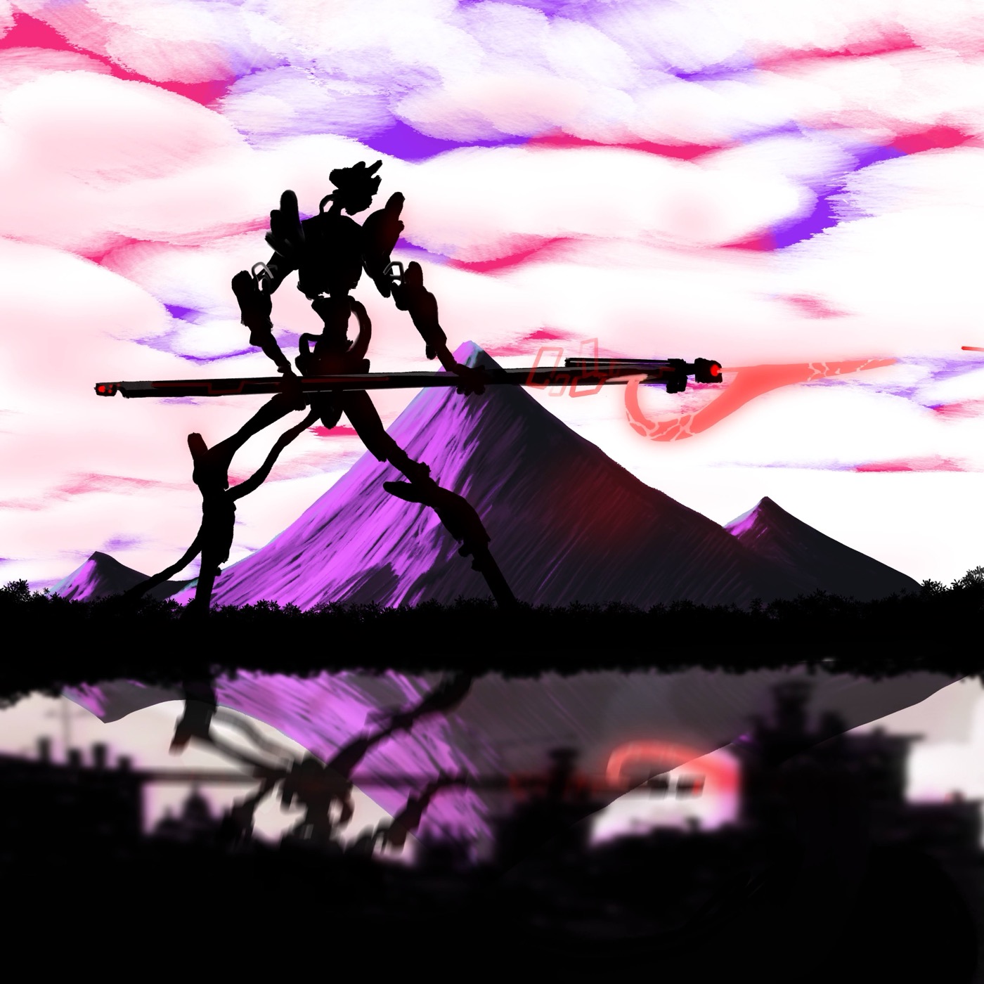
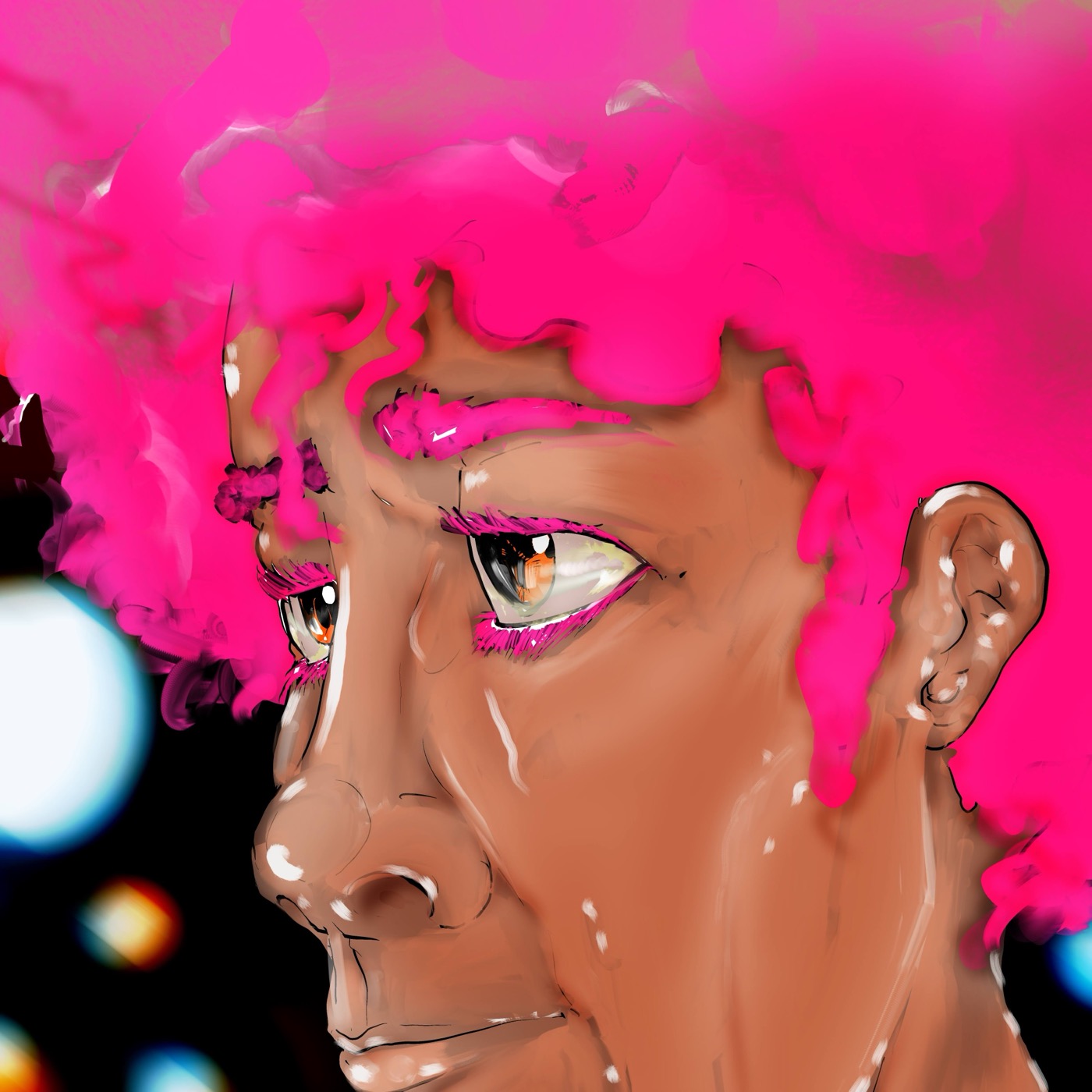
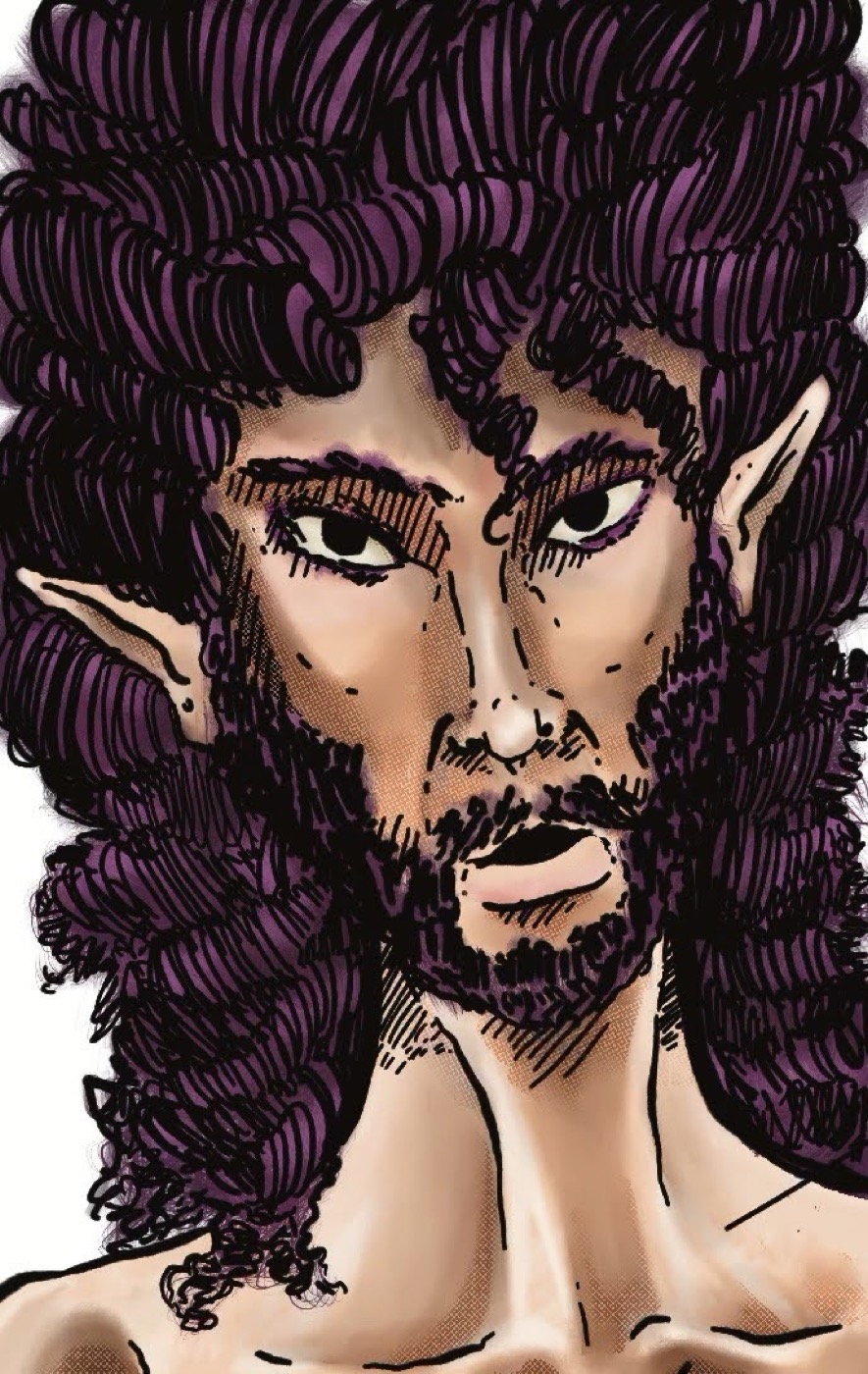
Art can fly.

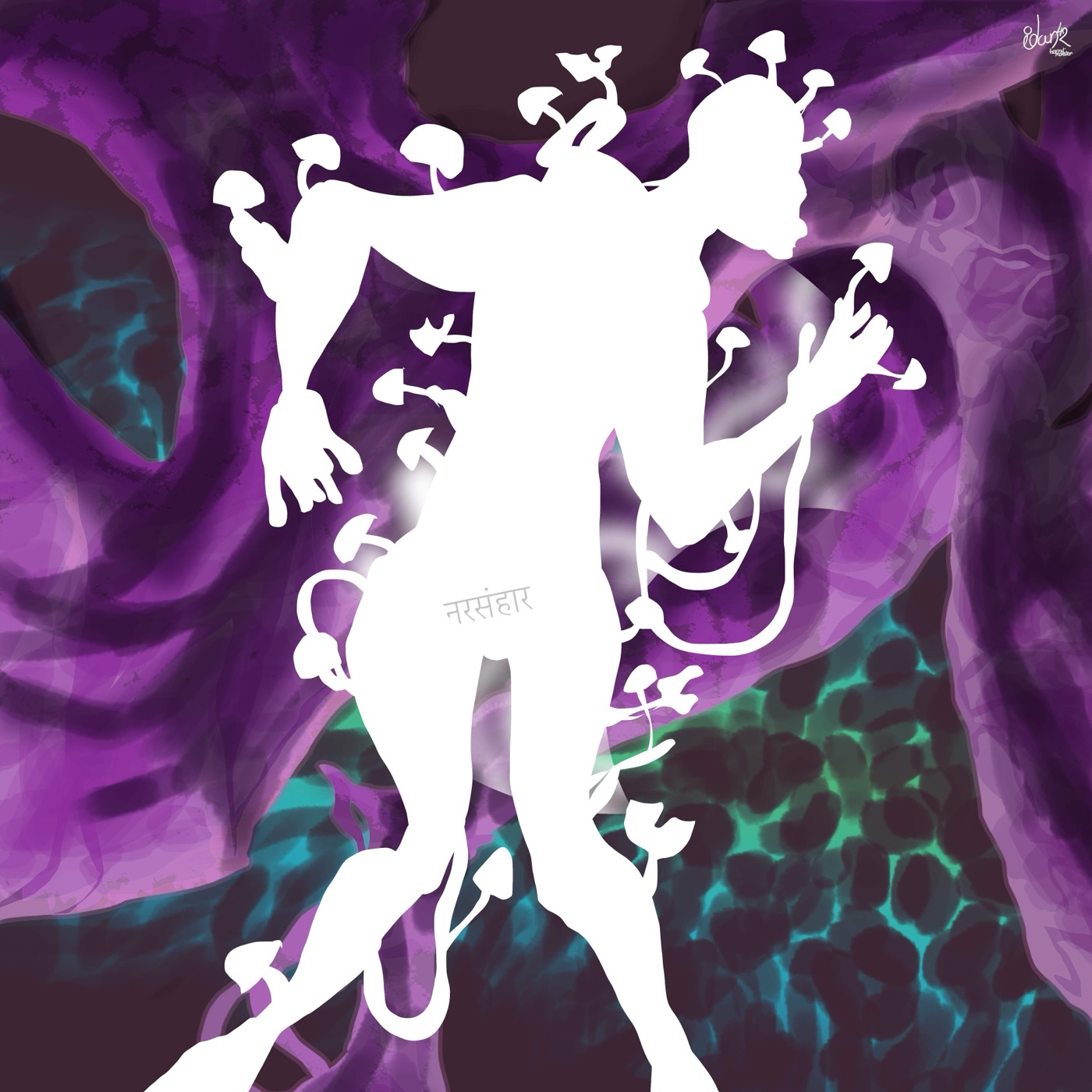
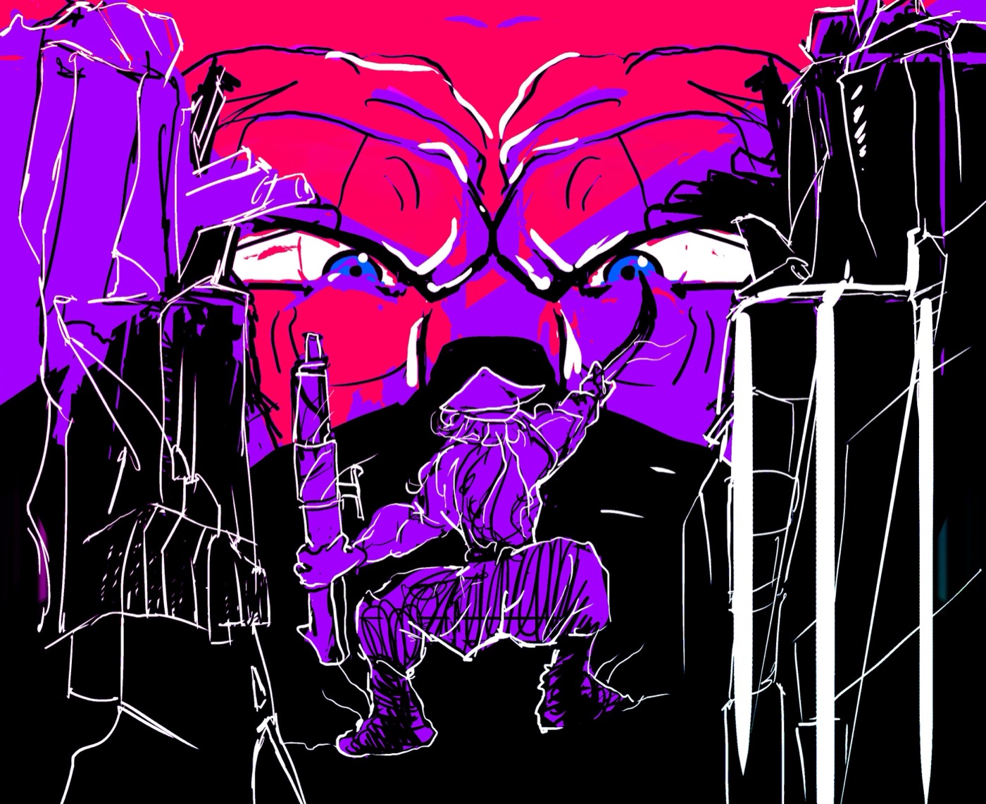
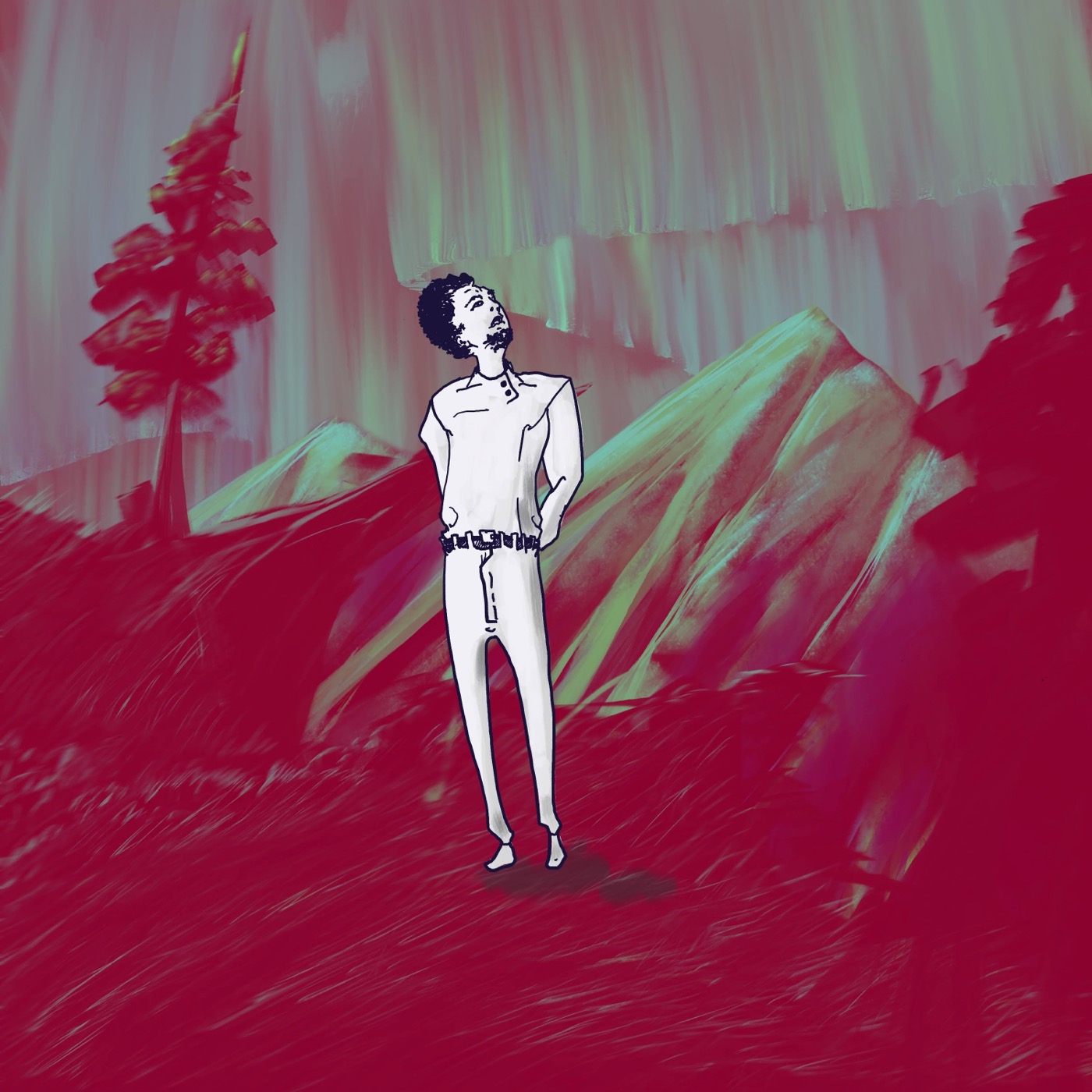
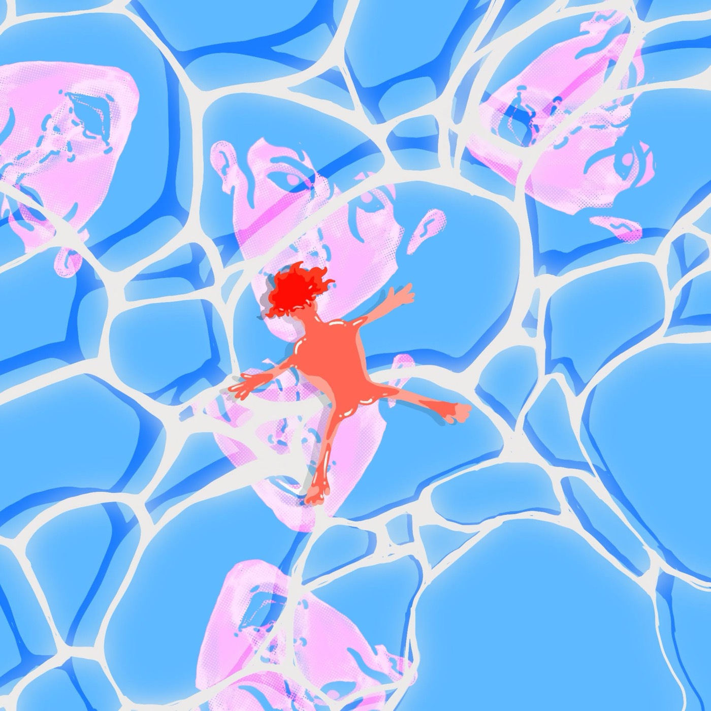
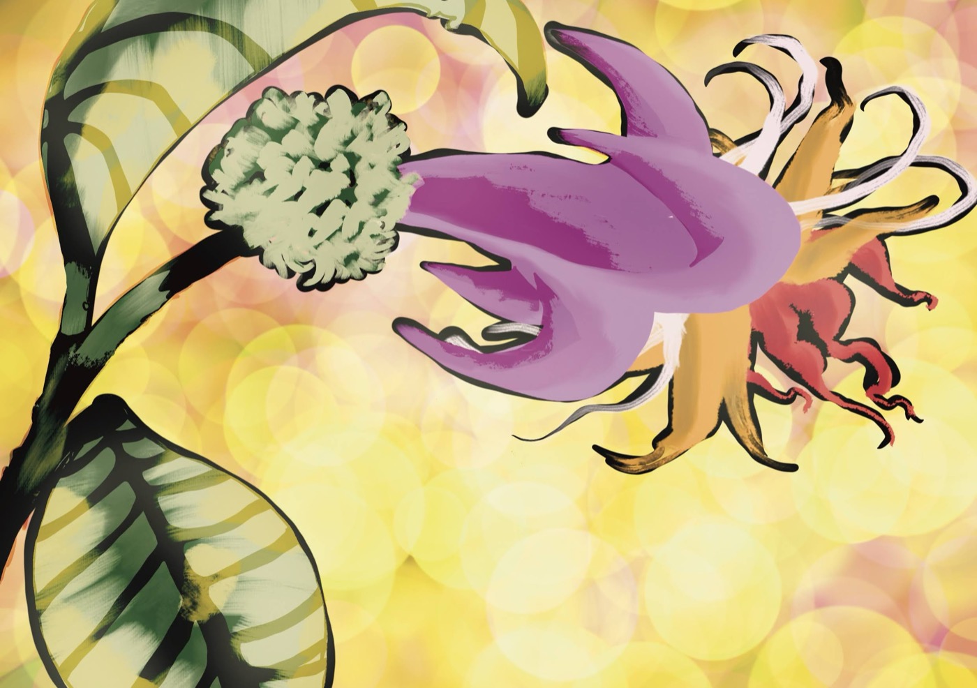
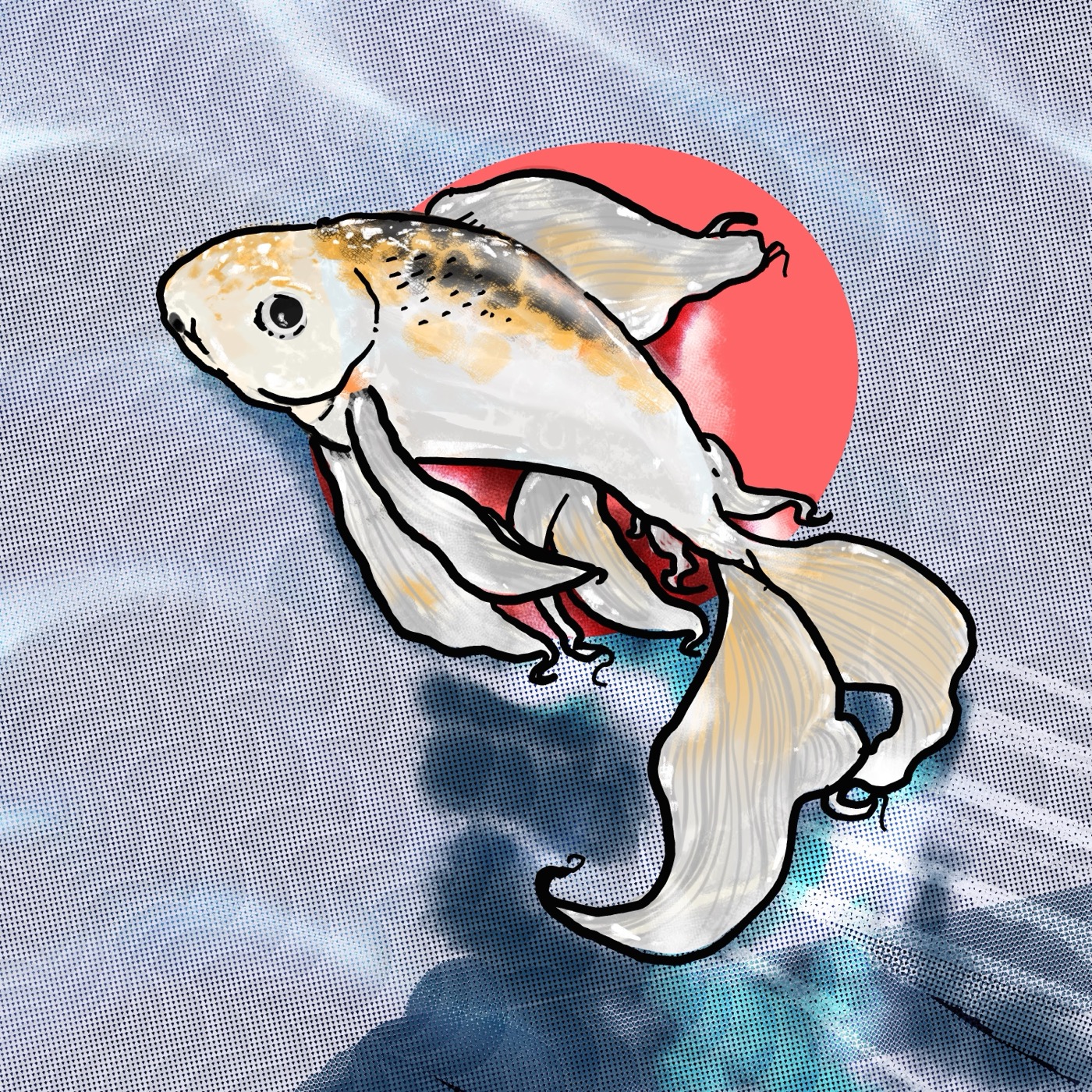
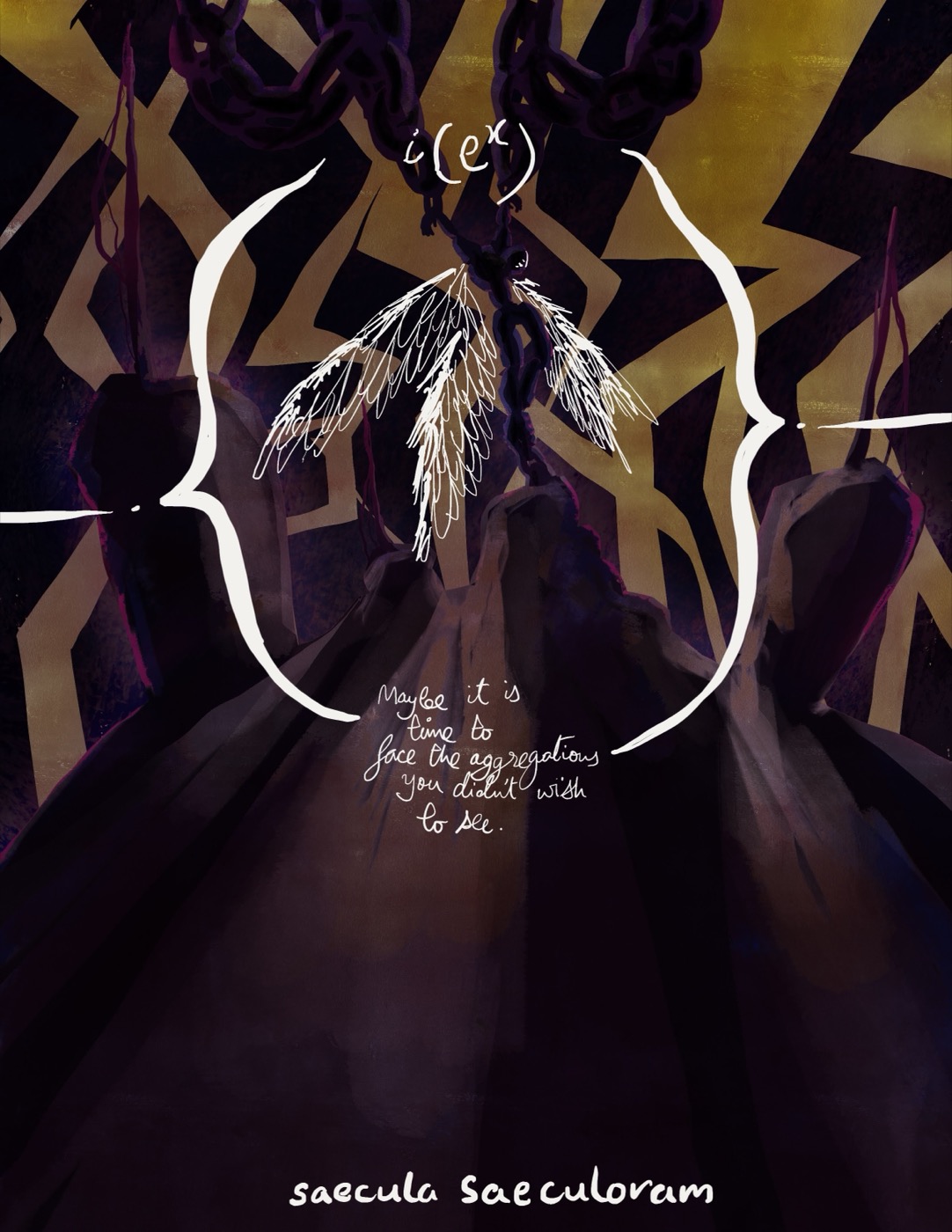
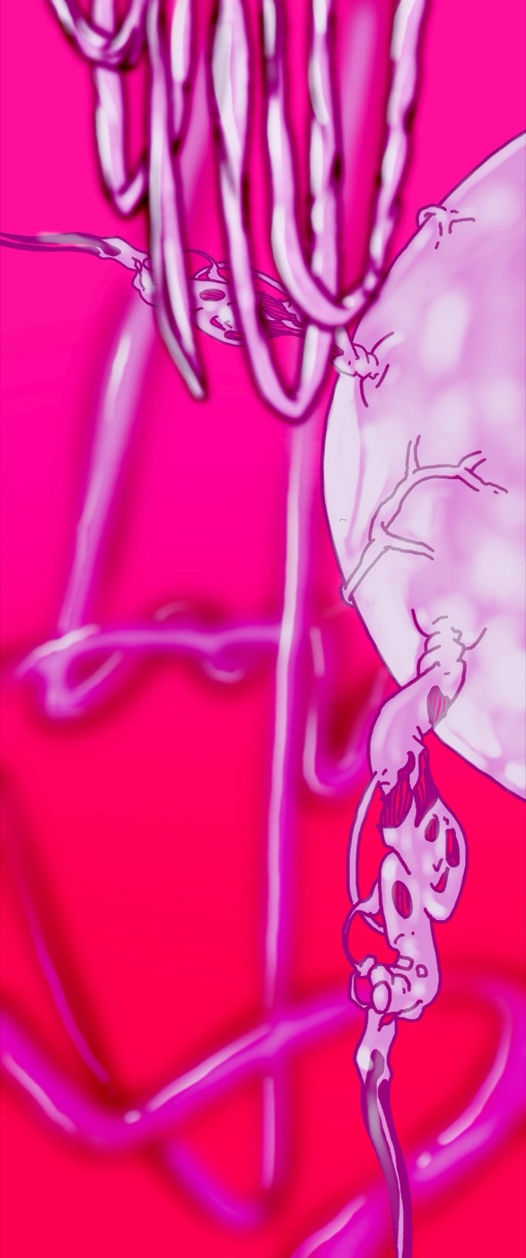
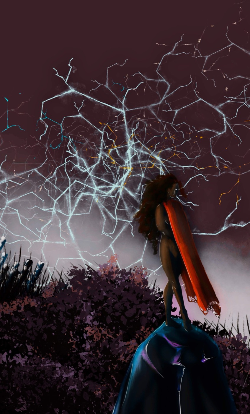
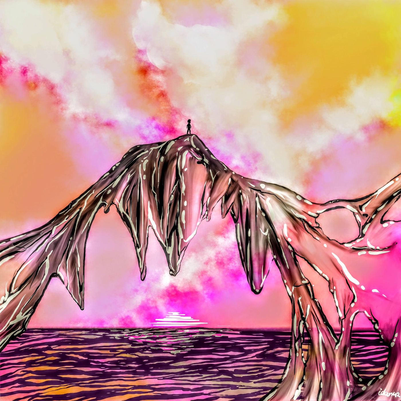
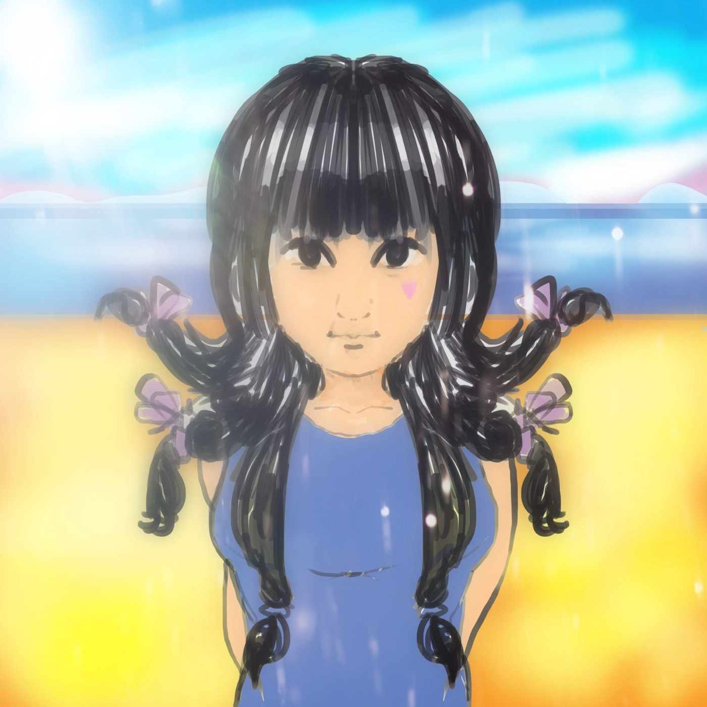
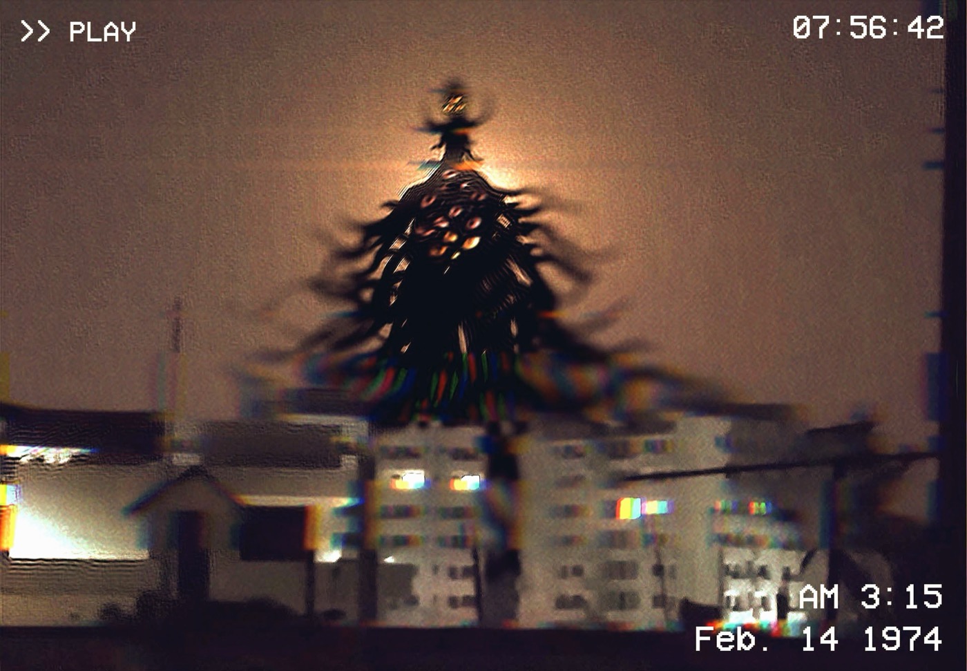
Pigs can too. By day I design complex data systems. By night I let loose with paint, pixels, and whatever idea happens to catch my attention.Pigs can too. By day I wrangle complex data systems. By night I let the monster out to play with paint, pixels, and whatever silly idea refuses to leave me alone.

Origin Files // Before the Enterprise Studio · Branding & identityStudio · War paint

Before the dashboards, there were brands.Before the dashboards, there was mischief.

Long before I was untangling enterprise systems, I was building identities from scratch: logos, music brands, pop-art, the works. This is where the monster learned to draw. The same instinct for structure and story just points at a different canvas now.Way before I tamed enterprise systems, I was loose with a sketchbook: logos, music brands, pop-art, whatever. This is where the monster cut its teeth. Same hunger for structure and story, pointed somewhere a lot louder.

COUP brand identity: three low-poly wolves in red, green, and blue beside the COUP wordmark, tagline connect.collaborate.create
Brand Identity · Logo System

COUP

A creative-collective brand built on one idea: connect, collaborate, create. Three low-poly wolves move as a pack: a different colour, a single silhouette. Drawn on a strict geometric grid so it scales from a favicon to a mug without losing its bite.

Identity · Mark construction · Merchandise
COUP wolf mark shown with its geometric construction grid and proportions
Mark · Construction

Built on a grid

The pack, measured. Every angle and proportion locked to a system, plus a greyscale lockup so it survives a single-colour print.

COUP branding applied to a coffee mug with a QR code and the line Your next big hit
Brand · In the wild

“Your next big hit.”

Identity off the artboard and onto an object, a QR-coded mug that turns a coffee break into a hook.

Future Past music brand system: production and company logos with glitch-coloured variants beside the Black Out album art
Music Brand · Identity System

Future Past

A full identity for a music label: production mark, company mark, and glitch-tinted variants that hold up whether they’re stamped on a release or a poster. Built as a system, not a single logo, so the brand stays recognisable as it mutates.

Logo system · Variants · Cover art
Black Out single cover art for Killagramz x Dasloe, dark distorted portrait with handwritten lyric the bird of hermes is my name eating my wings to make me tame
Cover Art · “Black Out”

The bird of Hermes

Single art for Black Out: a distorted portrait wrapped in an alchemical lyric. Type and image dissolving into each other, on purpose.

Vrg Pop magazine cover in bold Lichtenstein pop-art style: halftone dots, a comic POP explosion and the line We are here, the most unconventional take on the Indian art scene
Editorial · Pop Art

Vrg Pop

A magazine cover that screams: halftone dots, a comic-book POP!, and zero chill. “The most unconventional take on the Indian art scene.” Pure, loud fun.

Social Map logo explorations: three directions on a connected-network theme, from a globe wordmark to a node-graph app icon
Identity · Logo Exploration

Social Map

Three routes to one idea: connection as a shape. A globe that’s secretly a wordmark, a node-graph app icon, a single confident stroke. The exploration is the deliverable.

Kairos brand identity: navy and yellow stationery, business cards and a branded coffee cup with a folded-mark logo
Brand Identity · Stationery

Kairos

A crisp navy-and-yellow identity carried across the full kit: cards, letterheads, a coffee cup. A folded geometric mark that means “the right moment,” applied with restraint.

Same designer, different decade. The enterprise work is over in Same monster, louder era. The serious systems stuff lives in selected work

Studio · MotionStudio · Things that move

Logos that don’t sit still.Logos with a pulse.

A decade of this started in motion design: compositing, logo reveals, frame-by-frame. Hover or tap to play.It all kicked off in motion: compositing, glitchy reveals, frame-by-frame obsession. Hover or tap to wake them up.
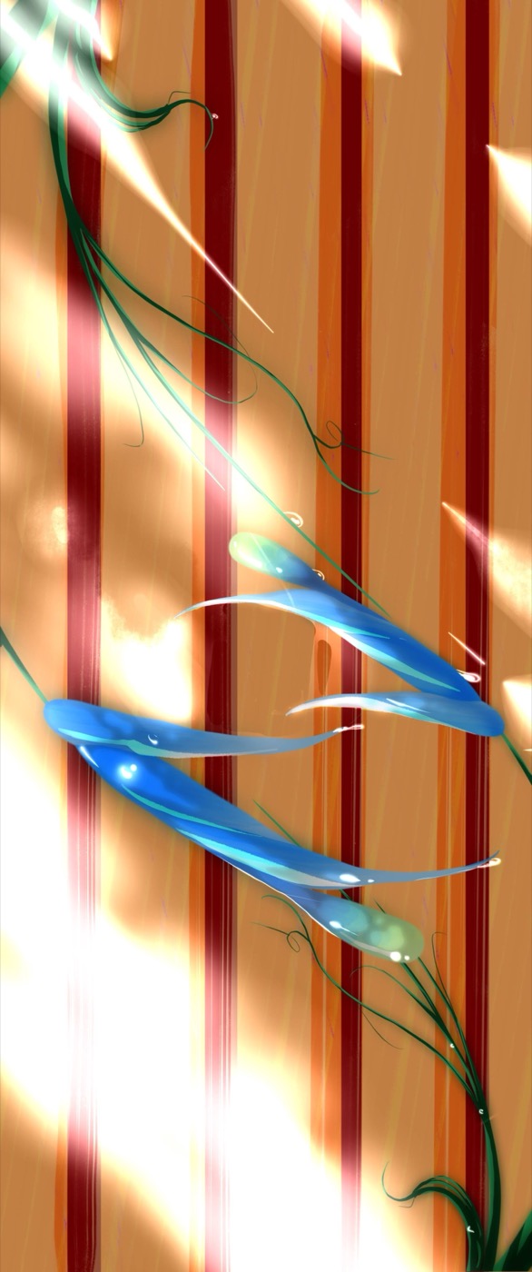
Logo Animation Daily Objects · glitch reveal
Logo Animation ASED · mark in motion
A Fractal Mind: a low-poly explainer film still in deep blues and warm light Motion for Good
Explainer Film · Mental Health

A Fractal Mind

An 80-second animated film made to help people understand schizophrenia: “let’s understand it, let’s help a friend.” A reminder that design isn’t only about dashboards. Concept, script, and animation, end to end.

Concept · Script · Animation
Product Explainer
Explainer Film · Enterprise Health-tech

TRD Symphony: Novartis

A character-driven explainer for a clinical-trials platform, turning a dense enterprise workflow into something a stakeholder actually wants to watch. Storytelling and product UI, in the same frame.

Storyboard · Animation · UI
Origin Files // The Range The rangeThe whole arsenal

One designer, many dialects.Many weapons, one monster.

Wayfinding, typography, industrial design: the disciplines that taught me how systems actually work before I ever touched an enterprise dashboard. Different surfaces, same obsession with clarity.Wayfinding, type, industrial design: the disciplines that drilled systems-thinking into me long before any enterprise dashboard. Different surfaces, same obsession.
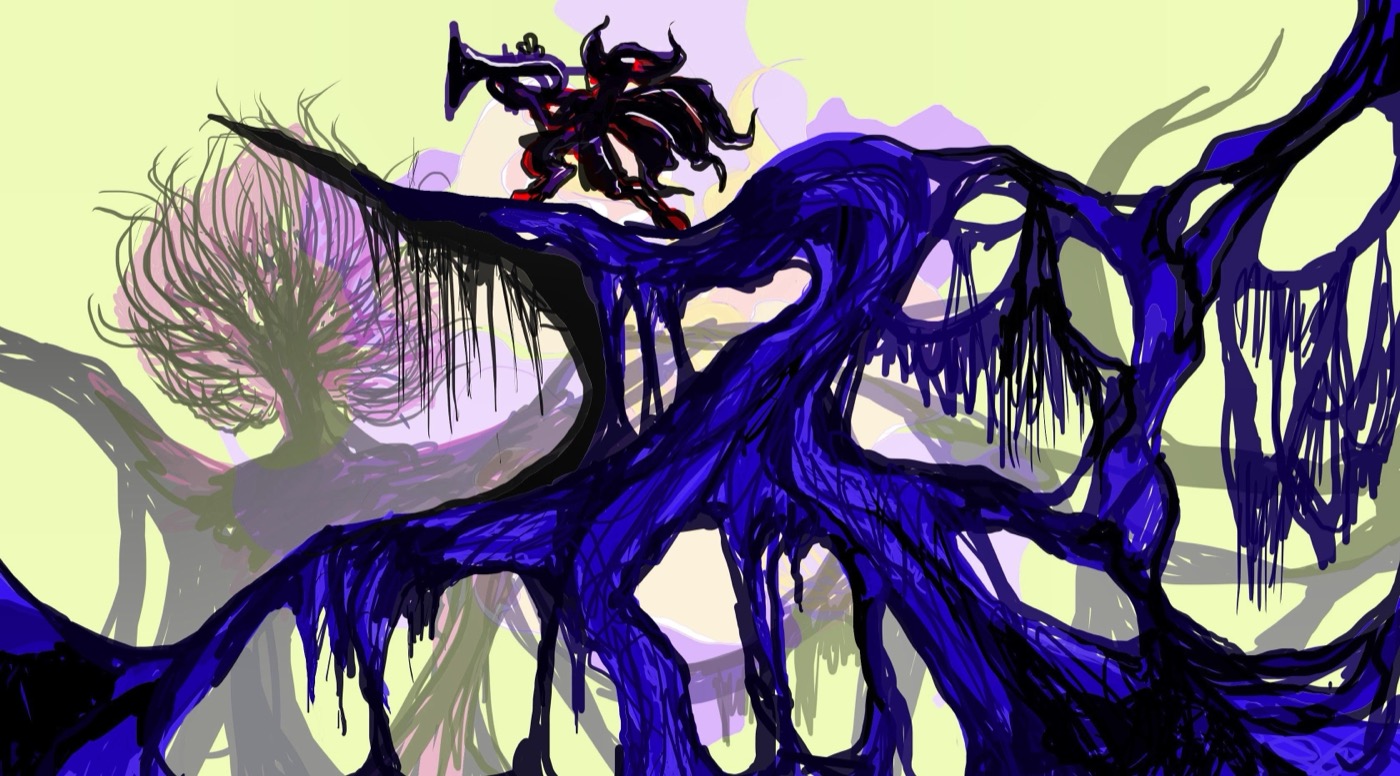
Metro wayfinding system: a colour-coded transit map with station markers and route lines
Wayfinding · Systems Design

Metro Signage System

A complete transit wayfinding language: maps, pictograms, directional markers, and the full classification of signs from “mind the gap” to emergency. Bilingual, accessible, and rigorous: design where one confusing sign has real consequences.

Mapping · Pictograms · Signage standards
Didot type specimen: the phrase Sphinx of black quartz, judge my vow set in high-contrast Didot
Typography · Editorial

Didot: Type Specimen

A specimen honouring Firmin Didot’s high-contrast serif: 140 languages, one elegant system. Pure typographic craft and editorial pacing.

Vernacular ATM industrial design: a curved teller-machine form with a yellow Welcome please insert your card screen
Industrial × Interaction · IBM

Vernacular ATM

Form and flow together: a teller-machine shell and its Hindi-first touchscreen, designed so first-time users in their own language never feel lost.

Same designer, different decade. The enterprise systems work lives in Same monster, louder era. The serious systems stuff lives in selected work

The archive

Older work, deeper cuts.

Collected portfolios and the corners of the internet where more of this lives.

Amateur Explorations

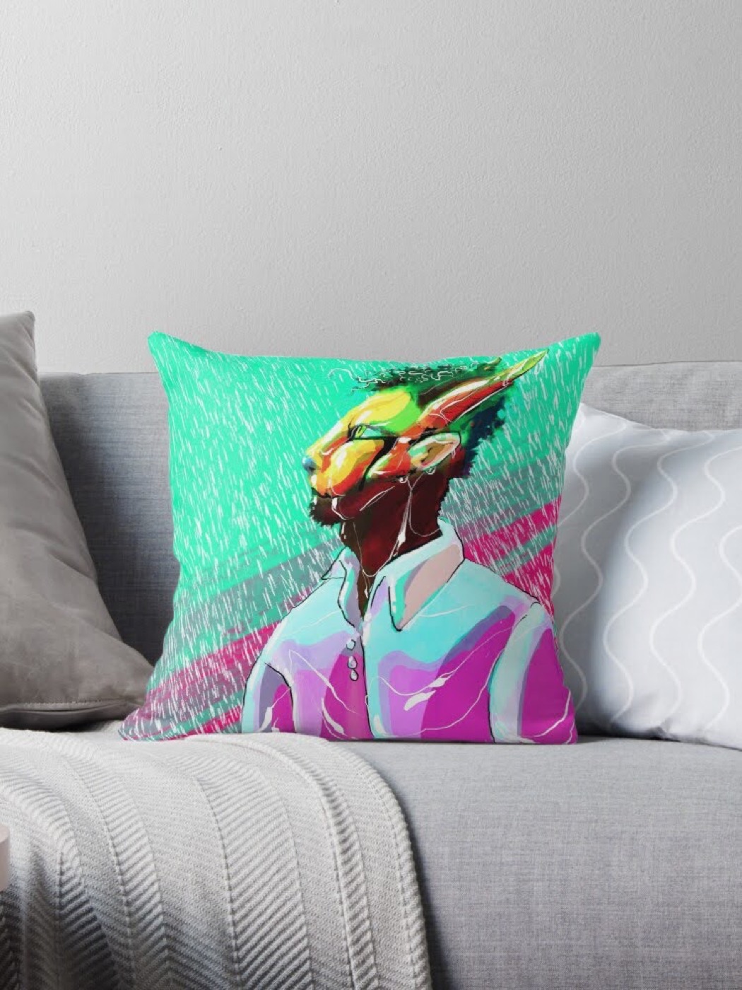
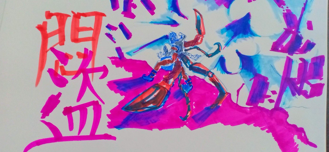
Loose, in-progress, and purely for fun. You can explore more of my work on Behance, and I am always down to chat.
behance.net/surabu
Say hello

Like what you see?

Whether you are interested in a commission, want to collaborate, or just want to swap ideas about art and design, my door is always open.